


To view links or images in signatures your post count must be 50 or greater. You currently have 0 posts.
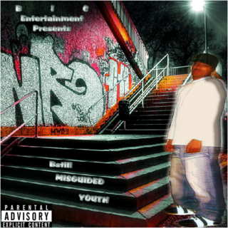
Quality on your picture was taken down from the effects. But other then that, I really like it bro.
thnx for the feed
To view links or images in signatures your post count must be 50 or greater. You currently have 0 posts.
Word, like dag said, looks better if you turned down the effects and contrast on the image, not feeling the blurry pic of you either, other than that, its alright.
To view links or images in signatures your post count must be 50 or greater. You currently have 0 posts.
I digg it. Pretty sick man
thanx for the feed
dope sig bullet
To view links or images in signatures your post count must be 50 or greater. You currently have 0 posts.

lmao you guys said mine wasnt good but THIS IS???
that shit is ass.
thats the last time ill post some graphics shit on rb cause yall are some some weirdos.
To view links or images in signatures your post count must be 50 or greater. You currently have 0 posts.

the text n the picture needs work the bg is dope though
To view links or images in signatures your post count must be 50 or greater. You currently have 0 posts.
GFX/WEB DESIGN - MIXING/MASTERING - VIDEO EDITING/TYPOGRAPHY
Contact:
To view links or images in signatures your post count must be 50 or greater. You currently have 0 posts.
[soundclick]9864916[/soundclick]

the image needs a lot of cleaning up... and the blending is sloppy, the person looks flat and the text needs work, maybe change up the font? I think the gradient in the text is a bit much because the piece is already busy...
I think with less effects it would be better
Graphics by
To view links or images in signatures your post count must be 50 or greater. You currently have 0 posts.
AOL Messenger : mysternof
Yahoo! Messenger : mysternof
E-Mail :
To view links or images in signatures your post count must be 50 or greater. You currently have 0 posts.
To view links or images in signatures your post count must be 50 or greater. You currently have 0 posts.

The guy is too stretched horizontally.
To view links or images in signatures your post count must be 50 or greater. You currently have 0 posts.
the text could be changed on this.. and i dont really like how the person looks on it, very very bright compared to the rest of the cover and as has been said.. flat and just doesnt fit in with the rest of it, im not to great @ feed lol but other then that keep the good work up man [:

yea your picture is kinda unproportional or w.e. but still looks good
To view links or images in signatures your post count must be 50 or greater. You currently have 0 posts.
 Posting Rules


 Reply With Quote