
Roy Pro Bowl Sig


Roy Pro Bowl Sig
To view links or images in signatures your post count must be 50 or greater. You currently have 0 posts.
MY NIGGA ROY WILLIAMS-----DALLAS COWBOYS
nope sorry you suck CUZOriginally Posted by CUZ
<a href="
To view links or images in signatures your post count must be 50 or greater. You currently have 0 posts.
src="http://myspace-625.vo.llnwd.net/01074/52/61/1074971625_l.gif "></a>
thanx
any more feed.
To view links or images in signatures your post count must be 50 or greater. You currently have 0 posts.
MY NIGGA ROY WILLIAMS-----DALLAS COWBOYS

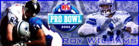
it's iight kind of basic. like that shadowin though fuck wat the other kid said h'es been banned on every alias he has. its iight but its not a probowl sig
more like a cowbiys one. keep elevatin.,
the render on the left of the sig looks good, but the one on the right needs to be fixed. also the border needs to be smaller, and not blue. make it like a clear white..
you know select all the sig, stroke it with black 3 px, then strok it again with white 2 px, and add the opacity to 50% and that should make it look better. The text is just ok, so keep messing around with it, and the superbowl symbol is fine where its at. You could even make the cowboy star in the bg a little more clear if you want. Just saying that because the render on the left is clear, so it would go good together, but that depends upon what you would want ur sig to be like.
overall its a decent sig thats still in progress to be great.

its iight but it can use some work
ARTIFICIAL | PO'ETHICS | INTELLIGENCE
thanx yall, specially Papi, good look wit tha help nigga
iight ima try n keep elevatin
1
To view links or images in signatures your post count must be 50 or greater. You currently have 0 posts.
MY NIGGA ROY WILLIAMS-----DALLAS COWBOYS
hey no problem man.
Ay do you think i should use the shadowy affect on roy holdin da diamond up, i dont wanna lower th opacity cuz it fuck it up, so iuno what i should make him look beter with. gotta any suggestins
To view links or images in signatures your post count must be 50 or greater. You currently have 0 posts.
MY NIGGA ROY WILLIAMS-----DALLAS COWBOYS
well were is the pic at on the net? is it a clear pic, like looks like a real photo, or is it kinda blurry?
its real pic, i lassoed it out of a larger pic.
To view links or images in signatures your post count must be 50 or greater. You currently have 0 posts.
MY NIGGA ROY WILLIAMS-----DALLAS COWBOYS
like this?
To view links or images in signatures your post count must be 50 or greater. You currently have 0 posts.
MY NIGGA ROY WILLIAMS-----DALLAS COWBOYS
aight then so im guessing it looks real good then. like real clear image of him. so what i would do is copy it to your (sig), then duplicate the layer, and add a gaussian blur of about 3, and then set that to overlay. Then on the duplicated image (the one you set the blur to) make a duplicate layer of that, and with that have a gaussian blur of about 1. and set that mode to solft light.
now thats what i really do to (my) pics/renders, but it just depends upon how that looks, for me to do anything else to it. so try that and see if it comes out.
iight
To view links or images in signatures your post count must be 50 or greater. You currently have 0 posts.
MY NIGGA ROY WILLIAMS-----DALLAS COWBOYS
didnt see this. but yeah i think that looks better, but the brushes can have a little work, cause now the star is really out there. so you could change the color of the brushes to be darker.
 Posting Rules

 Reply With Quote